| 1994 1995 1996 1997 1998 1999 2000 2001 2002 2003 2004 2005 2006 2007 2008 2009 2010 2011 2012 2013 2014 2015 2016 2017 2018 2019 <2020> 2021 2022 2023 2024 2025 | Index | 1994 1995 1996 1997 1998 1999 2000 2001 2002 2003 2004 2005 2006 2007 2008 2009 2010 2011 2012 2013 2014 2015 2016 2017 2018 2019 <2020> 2021 2022 2023 2024 2025 |
| <== Date ==> | <== Thread ==> |
|---|
| Subject: | Re: Sphinx/CSS question |
| From: | Matt Newville via Tech-talk <[email protected]> |
| To: | Mark Rivers <[email protected]> |
| Cc: | "[email protected]" <[email protected]> |
| Date: | Thu, 2 Jan 2020 11:13:35 -0800 |
Folks,
Thanks to Stuart Wilkins much of the EPICS areaDetector documentation has been converted from raw HTML to ReST, using Sphinx to generate Web pages on areadetector.github.io.
.wy-table-responsive {
overflow: visible !important;
}
} Much of the documentation is in the form of large tables, and I would like those to look as nice as possible. Stuart created a theme_override.css file that looks like this:
/* override table width restrictions */
@media screen and (min-width: 1024px) {
.wy-table-responsive table td {
/* !important prevents the common CSS stylesheets from overriding
this as on RTD they are loaded after this stylesheet */
white-space: normal !important;
}
I am having an issue where the tables look good when I build and serve the documents on my local machine, but they do not look as good on github.io. The problem is the maximum width of the page.
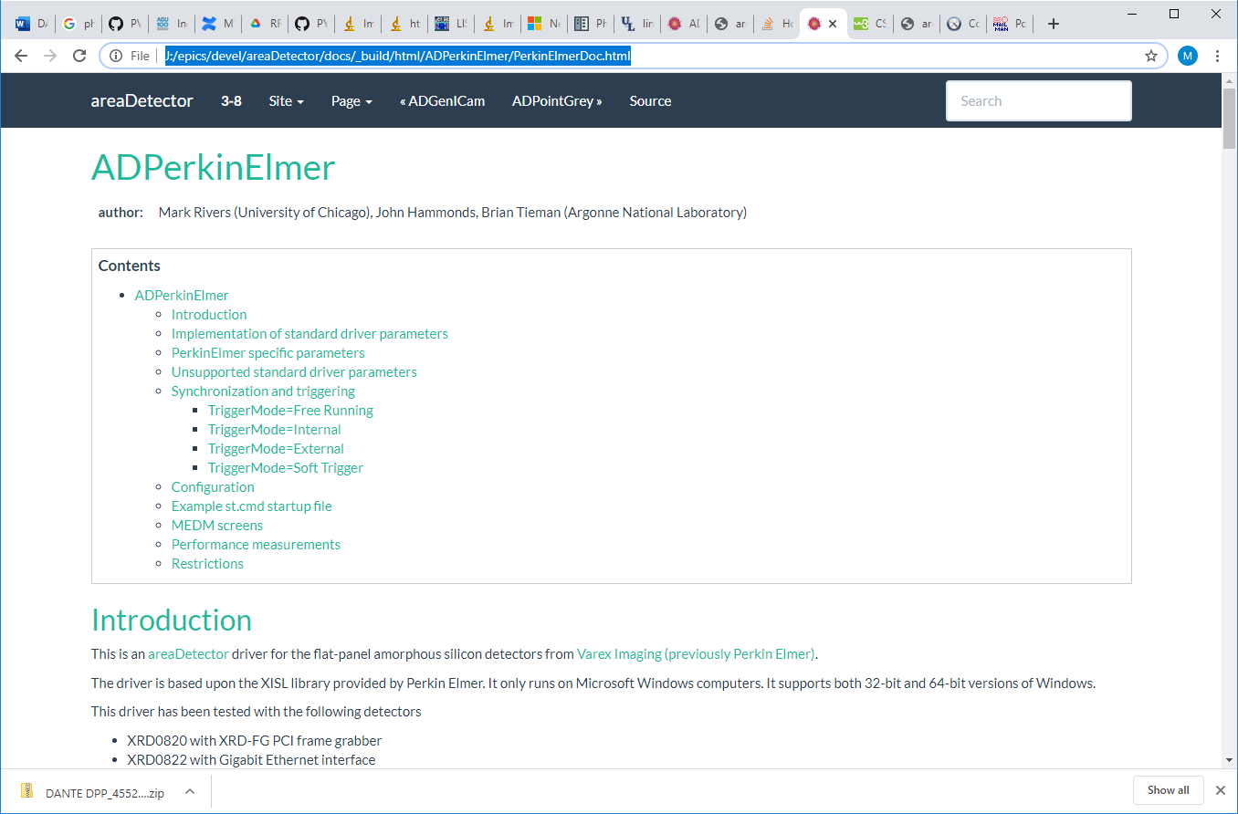
This is what a page looks like when I build and display on my local machine, where it looks OK. As I increase the width of the browser window the page gets larger up to some width, and then stops changing. When I change the min-width in the theme_override.css it does not seem to make any difference.
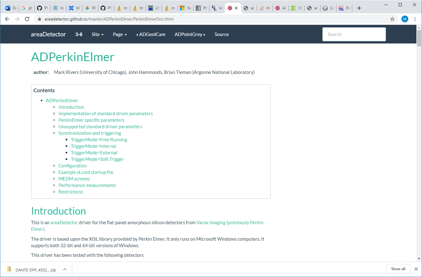
This is what the same page looks like on areadetector.github.io. I am displaying it in the same browser session, just a different tab. Note that the page is much narrower, even though the browser window is the same width.
My questions:
- Why is the .rst file being displayed differently on github.io versus my local machine? Both pages eventually stop growing wider as the browser window width is increased, but that limit is much narrower on github.io than on my local machine.
- Is there a setting I can change to make the page grow wider than the current maximum as the browser window width is increased?
Thanks,
Mark