| 1994 1995 1996 1997 1998 1999 2000 2001 2002 2003 2004 2005 2006 2007 2008 2009 2010 2011 2012 2013 2014 2015 2016 2017 2018 2019 <2020> 2021 2022 2023 2024 2025 | Index | 1994 1995 1996 1997 1998 1999 2000 2001 2002 2003 2004 2005 2006 2007 2008 2009 2010 2011 2012 2013 2014 2015 2016 2017 2018 2019 <2020> 2021 2022 2023 2024 2025 |
| <== Date ==> | <== Thread ==> |
|---|
| Subject: | RE: Sphinx/CSS question |
| From: | Mark Rivers via Tech-talk <[email protected]> |
| To: | "'Cobb, Tom (DLSLtd,RAL,LSCI)'" <[email protected]>, "'Jemian, Pete R.'" <[email protected]> |
| Cc: | "[email protected]" <[email protected]> |
| Date: | Thu, 2 Jan 2020 21:36:06 +0000 |
|
Thanks to Pete Jemian for posting my issue to this group:
https://groups.google.com/forum/#!forum/sphinx-users I received a reply that helps. I added the following to the html_theme_options in conf.py # Maximum width 'body_max_width': 1200, That makes the display on GitHub pages look the same as my local build. I think the width is actually ~1170, not 1200. If I increase the value from 1200 to 1600 that has no effect, the maximum width is still ~1170.
I would like to understand why I can’t make it even wider, but 1170 makes the tables look much better than the default of 800. Thanks, Mark From: Mark Rivers
Hi Tom, Ø
div.body { Ø
min-width: 450px; Ø
max-width: 800px; <-------- Ø
} Ø
I disabled this line (using inspect element in firefox on the top level div, similar tools exist in chrome) and the page seems to work as expected.
Ø
You could increase that limit in the theme_overides.css file to get around it, although it is odd that it works differently on your local machine to github.io. Thanks for the hint. I was not able to find a way to edit that in Chrome, but I did manage to do it in Firefox. However, I have 2 problems. -
I can increase 800px up to 1170px and the page width increases. However, above 1170px it does not increase further, even if the browser window is much larger. Any idea where this limit is coming from? -
I changed theme_overrides.css to this, i.e. I added the div.body block. corvette:docs/source/_static>more theme_overrides.css /* override table width restrictions */ @media screen and (min-width: 1024px) { .wy-table-responsive table td { /* !important prevents the common CSS stylesheets from overriding this as on RTD they are loaded after this stylesheet */ white-space: normal !important; } .wy-table-responsive { overflow: visible !important; } } div.body { min-width: 450px; max-width: 1200px; } I pushed that to github, which causes the areadetector.github.io pages to be updated by Travis. However, the display is still limited to 800px, it is not 1170px or 1200px. Is my syntax in theme_overrides.css OK? Is there something one needs to do to have theme_overrides.css be loaded, or is that automatic? Thanks, Mark From: Tech-talk <[email protected]>
On Behalf Of Cobb, Tom (DLSLtd,RAL,LSCI) via Tech-talk Hi Mark, The line of code that is restricting the max width is in line 220 of _static/basic.css: div.body { min-width: 450px; max-width: 800px; <-------- } This appears to be provided by the sphinx theme. I disabled this line (using inspect element in firefox on the top level div, similar tools exist in chrome) and the page seems to work as expected. You could increase that limit
in the theme_overides.css file to get around it, although it is odd that it works differently on your local machine to github.io. Thanks, Tom From: Tech-talk <[email protected]>
on behalf of Mark Rivers via Tech-talk <[email protected]> Folks, Thanks to Stuart Wilkins much of the EPICS areaDetector documentation has been converted from raw HTML to ReST, using Sphinx to generate Web pages on areadetector.github.io. .wy-table-responsive { overflow: visible !important; } } Much of the documentation is in the form of large tables, and I would like those to look as nice as possible. Stuart created
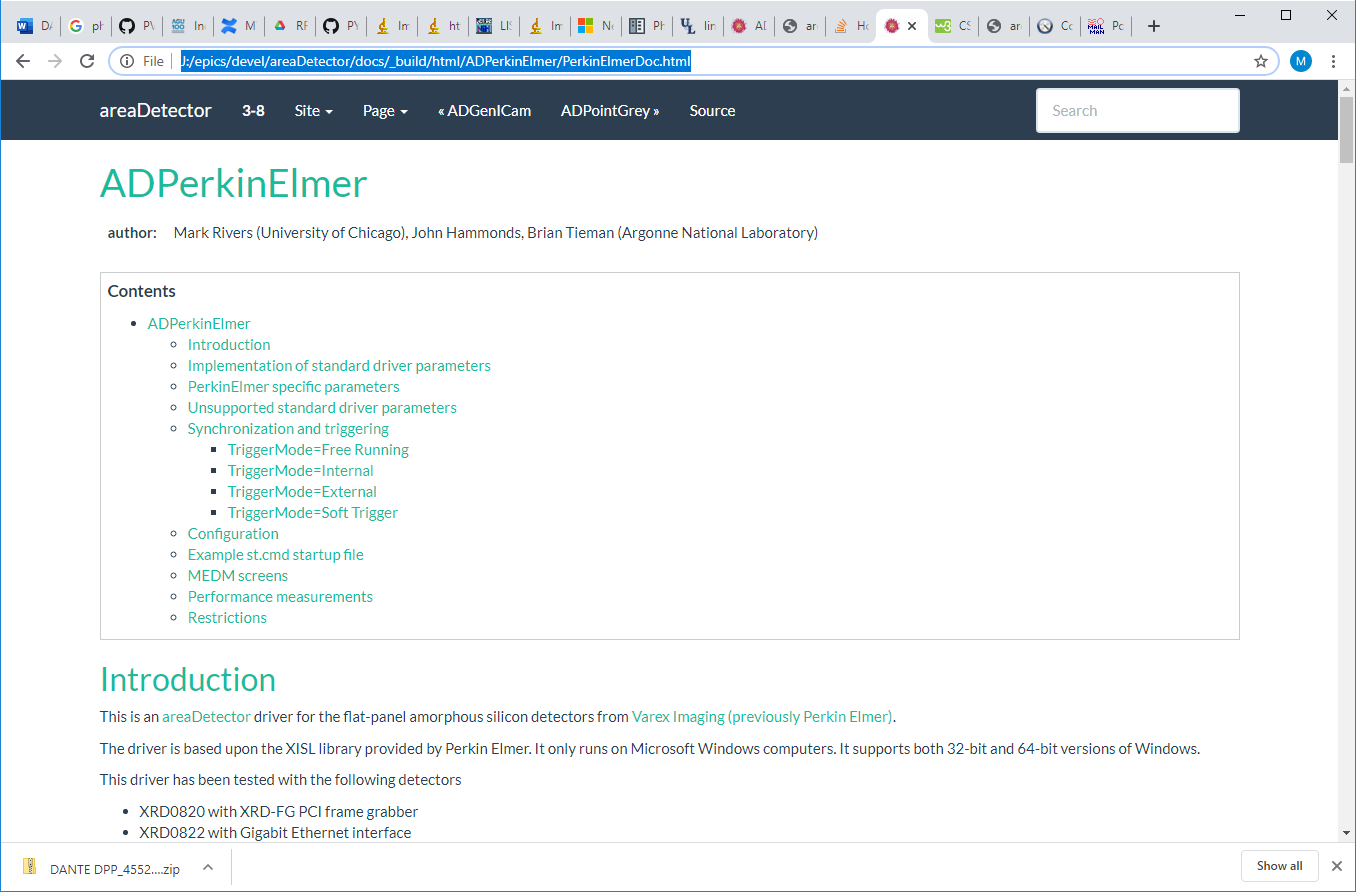
a theme_override.css file that looks like this: /* override table width restrictions */ @media screen and (min-width: 1024px) { .wy-table-responsive table td { /* !important prevents the common CSS stylesheets from overriding this as on RTD they are loaded after this stylesheet */ white-space: normal !important; } I am having an issue where the tables look good when I build and serve the documents on my local machine, but they do not look as good on github.io. The problem is the
maximum width of the page. This is what a page looks like when I build and display on my local machine, where it looks OK. As I increase the width of the browser window the page gets larger up to
some width, and then stops changing. When I change the min-width in the theme_override.css it does not seem to make any difference.
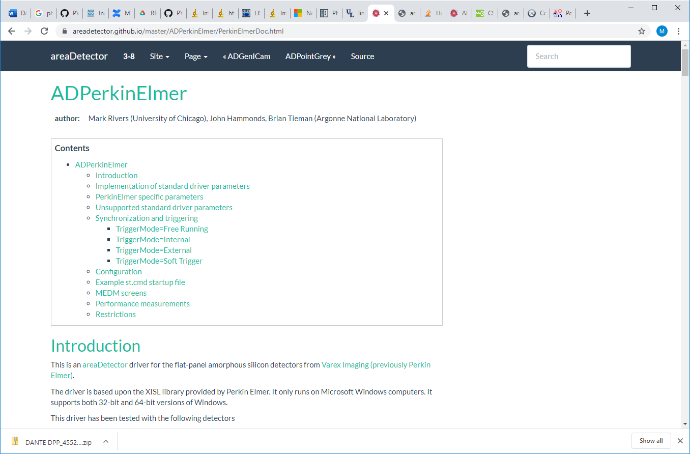
This is what the same page looks like on areadetector.github.io. I am displaying it in the same browser session, just a different tab. Note that the page is much narrower,
even though the browser window is the same width.
My questions: -
Why is the .rst file being displayed differently on github.io versus my local machine? Both pages eventually stop growing wider as the browser window width is increased, but that limit
is much narrower on github.io than on my local machine. -
Is there a setting I can change to make the page grow wider than the current maximum as the browser window width is increased? Thanks, Mark -- This e-mail and any attachments may contain confidential, copyright and or privileged material, and are for the use of the intended addressee only. If you are not the intended addressee or an authorised recipient of the addressee please notify us of receipt
by returning the e-mail and do not use, copy, retain, distribute or disclose the information in or attached to the e-mail. |